Smaller Images, Same Story: AVIF, WebP and the Picture Element
The Grenadier review needed photographs. That gave me a real page to measure what saves bytes, what the browser actually downloads, and whether a complete picture pipeline is still too much trouble.
The short version
The right pixel dimensions did more work than the newer codec. The newer codec then made the correctly sized image smaller again.
This is a photography workflow: continuous tones, texture and camera detail. Vector artwork is a different job. The logo on our home page—the one whose eye follows your pointer—is an SVG, and it gets its own section because it would make a terrible AVIF.
In our benchmark, a 736-pixel copy of the Grenadier photograph was 48.0 KiB as JPEG, 42.0 KiB as WebP and 30.0 KiB as AVIF. The native 1448-pixel AVIF was 83.5 KiB. In other words, the correctly sized JPEG was substantially smaller than the oversized AVIF, while the correctly sized AVIF produced the smallest file of the three at these settings.
The old objection is that producing and maintaining all those files is tedious. That objection hasn't aged well. A modern build can start with one private master, create several widths in AVIF and WebP, strip metadata, hash every output and hand the browser a complete <picture>. Deployment moves immutable files. The application does no image work while serving a request.
For a site with a real build and deployment process, fully using <picture>, srcset, sizes and multiple formats is easier than ever—and, for photographic content, worth the effort.
A real page, not a stock-photo test
This started with the photographs in our 10,000-mile Grenadier steering-stabilizer review. The lead image is a 1448 × 1086 Google Photos web export of my own installation photograph. It contains the awkward material that image compressors actually have to deal with: fine grit, scratched black metal, bright pavement, shadows and red lettering.
The article column is at most 736 CSS pixels wide. On a standard-density desktop display, delivering all 1448 source pixels would therefore send almost twice the width the layout can show. A high-density display can use those pixels; a typical phone or standard desktop usually cannot.
That makes the page useful for answering two separate questions:
- How much does choosing the appropriate width save?
- At that width, how much more do WebP and AVIF save?
How the benchmark works
The reproducible benchmark starts every encode from the same normalized sRGB PNG working copy of the photograph. PNG is the prepared input used for this experiment, not the camera's original format or a requirement for the approach. Sharp 0.35.4 resizes that copy to 480, 736, 960 and 1448 pixels wide and strips output metadata. Each size is then encoded as:
- JPEG at quality 82 with MozJPEG and 4:2:0 chroma subsampling;
- WebP at quality 84 and effort 6; and
- AVIF at quality 60, effort 5 and 4:2:0 chroma subsampling.
Those quality numbers are encoder settings, not a shared quality scale. An 82 in one codec is not meaningfully “22 points better” than a 60 in another. I chose production-minded settings, inspected the rendered results at their intended display size and kept the source, dimensions and crop fixed.
The script repeats each encode five times to observe the build-time cost, but the graph uses the deterministic output bytes. Exact source hashes, codec versions, settings, dimensions and results are retained with the post in our private repository so I can rerun the comparison instead of relying on memory. The method and results are described here; the source photograph and scripts are not currently available as a public reproduction bundle.
The results
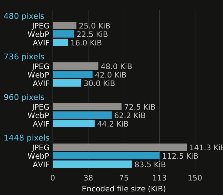
The exact results were:
- 480 pixels: JPEG 25.0 KiB, WebP 22.5 KiB, AVIF 16.0 KiB.
- 736 pixels: JPEG 48.0 KiB, WebP 42.0 KiB, AVIF 30.0 KiB.
- 960 pixels: JPEG 72.5 KiB, WebP 62.2 KiB, AVIF 44.2 KiB.
- 1448 pixels: JPEG 141.3 KiB, WebP 112.5 KiB, AVIF 83.5 KiB.
At each width, AVIF was about 26–29% smaller than WebP and 36–41% smaller than JPEG with these settings. WebP was about 10–20% smaller than JPEG.
The more important comparison crosses the rows. The 480-pixel JPEG was 70% smaller than the native-width AVIF. The 736-pixel JPEG was 42% smaller. A newer format cannot rescue a file that carries far more pixels than the layout and display need.
When smaller starts losing the story
Bytes are easy to count. The useful detail they buy needs a closer look. These two examples start with the same 736 × 552 pixels and use the same AVIF encoder settings except for quality: our normal 60, then a deliberately aggressive 10.
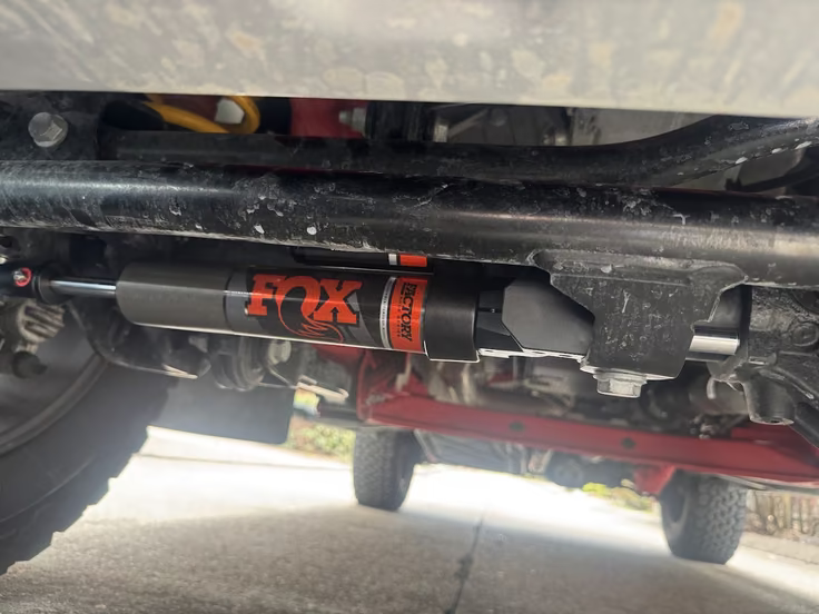
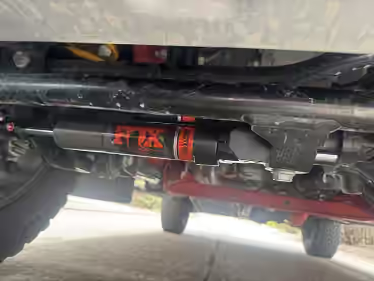
Quality 10 removes another 85% of the bytes, but the red lettering and scratched tube lose definition. The enlarged pair below uses identical crops taken after decoding the full images, with each pixel doubled without smoothing. Quality 60 is on the left; quality 10 is on the right.
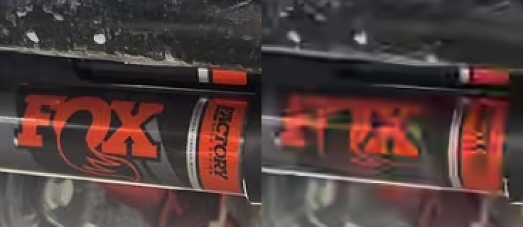
At reading size I had to look twice; the quality-10 image is a perfectly acceptable photograph of a steering stabilizer. The crop is where it stops being mine. The FOX lettering goes soft and the scratches on the tube turn into smudges. Four and a half kilobytes bought a picture of a part. Thirty bought a picture of my part.
Judge the full pictures at reading size first, then use the crop to see what changed. Magnification is useful for finding artifacts; it can also make differences seem more important than they are in the finished page.
These illustrations are intentionally delivered as larger, lossless WebP files so the comparison works across our supported browsers without another lossy encode. The quoted sizes belong to the original AVIFs, not the illustrations. Their settings, byte counts and decoded-pixel hashes are recorded with the benchmark.
Picture and srcset do different jobs
<picture> chooses among types or art directions. srcset offers candidates of the same image at different resolutions. sizes tells the browser how much CSS space the image will occupy before the stylesheet and image have finished loading. It describes the expected layout; it does not set the rendered width. CSS still makes the image responsive.
Our lead photograph now reduces to this logical structure before the asset paths are hashed:
<picture>
    <source
        type="image/avif"
        srcset="installed-480w.avif 480w, installed-736w.avif 736w, installed-960w.avif 960w, installed.avif 1448w"
        sizes="(max-width: 49.5rem) calc(100vw - 3.5rem), 46rem"
    />
    <img
        src="installed.webp"
        srcset="installed-480w.webp 480w, installed-736w.webp 736w, installed-960w.webp 960w, installed.webp 1448w"
        sizes="(max-width: 49.5rem) calc(100vw - 3.5rem), 46rem"
        width="1448"
        height="1086"
        alt="…"
    />
</picture>
The browser evaluates the sources in order and uses the first eligible one. Here, that means AVIF when supported, then the WebP candidates on the <img>. Within the selected format, it uses the declared slot size, display density and its own selection policy to choose a resolution. It does not download every format or compare their byte counts. Source order expresses our preference; the build measurements inform that choice. MDN explains the selection rules.
There is a visual use for <picture> too: art direction. A phone could receive a tighter crop around the stabilizer while a desktop shows the wider installation context. That changes the composition; srcset alone changes resolution. For this benchmark the crop stays fixed, but keeping the important part recognizable on a small screen can matter as much as saving bytes.
The fallback is an audience decision. Our supported browser versions can decode WebP, so it is sufficient on the final <img> here. A site serving older clients may need JPEG there instead. MDN's format compatibility notes, checked September 6, 2026, list AVIF across the major engines but with different version requirements; support for <picture> alone does not guarantee support for every codec inside it.
What the review now sends
The Grenadier review contains one full-column landscape photograph and two portrait photographs capped at 480 CSS pixels. Browser tests load and scroll through the actual built page, inspect each image's currentSrc, and verify the fallback by making the AVIF type unsupported before the document is parsed.
For the three photographs together, Chromium selected:
- 390-pixel viewport at 1×: three 480-pixel AVIFs, totaling 72.6 KiB.
- 390-pixel viewport at 2×: three 736-pixel AVIFs, totaling 142.1 KiB.
- 1440-pixel viewport at 1×: a 736-pixel lead and two 480-pixel portraits, totaling 86.6 KiB.
- 1440-pixel viewport at 2×: the 1448-pixel lead, a 960-pixel portrait and the other portrait's native 815-pixel file, totaling 238.0 KiB.
The September 6 cross-browser check reproduced those same four selections in Firefox and WebKit. Each run requested one AVIF per photograph, and the forced-unsupported-source check loaded the responsive WebP fallback in all three engines. The graph and quality illustrations also loaded without horizontal overflow on the narrow layout.
Before responsive widths, the three native AVIFs totaled 267.5 KiB. The standard-density mobile selection is 73% smaller and the standard-density desktop selection is 68% smaller. Format selection still matters: the AVIF sets are about 30% smaller than their equivalent responsive WebP sets in both cases.
This is image payload, not whole-page weight, and it is not the same thing as a 73% improvement in Largest Contentful Paint. Network conditions, cache state, server latency, decode work and rendering all participate in that measurement. What the test proves is narrower and still useful: the browser receives substantially fewer image bytes, while preserving the useful resolution available from the source. Source detail still sets the ceiling: the 815-pixel portrait cannot fully supply the 960 pixels its 480-CSS-pixel slot asks for at 2× density. Upscaling would add pixels, not recover that missing detail.
The build script changes the calculation
Photographs will usually arrive as JPEG or HEIC originals. Keep the best available original as the master, then prepare a source copy for the web build. For this review, the repository contains web-sized sRGB PNG working copies made from the available exports. PNG provides a lossless intermediate here; it is not a required photographic source format, and converting an export to PNG cannot recover detail already lost.
Our current build accepts JPEG and PNG inputs; HEIC originals need conversion during import. The prepared sources sit outside every public static directory, so the server and nginx cannot serve them.
During the build, Sharp applies orientation, converts to sRGB, creates useful widths in AVIF and WebP and strips metadata. The asset build hashes every output, and the HTML renderer uses the same width and filename policy for srcset. A private report records the source hashes, settings and resulting file sizes so I can check what changed.
Deployment moves the tested static files with the correct MIME types and immutable caching. The running application does no resizing or encoding; the browser chooses from the prepared files. The validation rules, asset manifest and deployment workflow deserve a separate discussion. Here, the useful result is simple: the author supplies a photograph, and repeatable tooling handles the variants.
Encoding is slower where it should be
AVIF took the longest to create. In the September 6 rerun on an Apple M5 Max running macOS 26.5.2 and Node.js 26.4.0, the median of five full-width encodes was roughly 0.44 seconds, compared with 0.15 seconds for WebP and 0.07 seconds for MozJPEG. At 736 pixels, the medians were about 0.17, 0.06 and 0.03 seconds respectively. These are machine- and load-dependent build timings, not browser decoding times; the rerun left the measured file sizes unchanged.
That is a meaningful multiplier and an unimportant wait for three photographs in a build. It would be a bad surprise inside a web request. Moving the work to a repeatable build turns the expensive codec into a publishing cost paid once, while every visitor receives the smaller file.
Format is only part of image performance
The lead image is eager because it appears near the top of the review. The two installation close-ups remain natively lazy-loaded. Every <img> carries intrinsic width and height so the browser reserves the correct aspect ratio before the bytes arrive, and every generated URL contains a content hash so it can be cached immutably.
Those choices solve different problems:
- format and quality affect bytes and visible artifacts;
srcsetandsizesprevent needless resolution;- eager or lazy loading affects when a request begins;
- intrinsic dimensions protect layout stability; and
- content hashes make a long cache safe across deployments.
Calling a file AVIF does not guarantee any of the others.
When does the reader see something useful?
Encoding time measures work on the publishing machine; decoding and painting happen on the reader's device. A follow-up loading-speed experiment can compare cold and warm loads on a slower connection, capture a filmstrip and measure Largest Contentful Paint (LCP) and Cumulative Layout Shift (CLS), including on a real phone. This article measures file sizes and browser selection; it does not claim those unmeasured speed gains.
Progressive JPEG deserves a mention here: an early, rough version can become visible while the rest downloads. A smaller completed file and an earlier recognizable image are different benefits. A filmstrip would let me compare that experience with our AVIF and WebP outputs instead of assuming the byte winner always feels fastest. Image performance guidance explains why perceived speed needs its own attention.
For the image that actually drives LCP, make its URL discoverable in the initial HTML, avoid lazy loading and consider fetchpriority="high". That is a priority hint, not a reason to mark every image high. Preload is useful when discovery is otherwise delayed; adding it blindly can compete with other essential resources. These are targeted LCP techniques, not changes measured by this benchmark.
The quieter parts of the experience matter too: reserve space so text does not jump, describe meaningful images with useful alt text, and use captions to explain why a photograph is there. A fast image should still help someone understand the story.
For vector artwork, SVG is our best friend
For artwork that begins as vector shapes, SVG keeps those shapes intact. Logos, icons, vector clipart, charts and diagrams can stay sharp as the layout changes, on high-density screens and when a reader zooms in. One SVG can cover those sizes without a folder of raster exports or a width-by-width srcset.
The logo on our home page shows why I like this so much. It is an inline SVG: the browser can address its individual parts. CSS changes its colors with the light and dark themes. Its eye blinks and its gaze follows the pointer, with those effects respecting reduced-motion preferences. The same artwork stays crisp throughout. Inline SVG makes that combination of responsive sizing, theme-aware color and playful interaction straightforward; an SVG loaded through an ordinary <img> does not expose its internal shapes to the page's CSS and JavaScript in the same way.
Simple vector artwork can also be compact, preserves transparent backgrounds and is editable as text. Removing unnecessary editor metadata and compressing the markup with Brotli or gzip can reduce the delivery cost further. Complexity still matters: thousands of paths and elaborate filters can make an SVG heavy, and placing a JPEG inside an SVG does not turn the photograph into resolution-independent artwork.
The benchmark graph above uses SVG too. Its bars and labels are shapes and text, so the browser can render them at the required display size. That is a useful companion to the photographic pipeline: choose the representation that fits the content.
Screenshots and images containing small text may instead benefit from PNG or lossless WebP. Lossless encoding preserves the decoded pixels; it does not recreate detail already lost in the source. That is also why the quality illustrations use lossless WebP. The format guide is a useful reminder to choose for the content, not just the newest extension.
A few honorable mentions
- JPEG XL: a worthwhile future benchmark, with lossy and lossless modes, HDR and progressive decoding in the format. In the compatibility details checked September 6, 2026, MDN lists Safari 17 and later, Chrome 145 and later behind a flag, and Firefox preview releases. Safari's implementation waits for the complete download. Format capability and shipped browser behavior are separate questions; keep a fallback and recheck support when adopting it.
- Jpegli and MozJPEG: the encoder can improve the result while the file remains an ordinary JPEG. I already use MozJPEG here. Jpegli's published evaluation makes it an interesting additional comparison, but its reported savings should not be borrowed for our photographs without testing them.
- Brotli and gzip: another useful job for the build, especially for SVG, HTML, CSS and JavaScript. Already-compressed photographic formats generally gain little from another compression layer. Our SVG graph is a natural example. Text compression guidance covers this distinction.
- Video in place of photographic GIFs: future installation clips should be tested as video rather than automatically exported as animated GIFs. Video can save substantial bandwidth, and a player can offer useful playback controls. Respect motion preferences and give readers control over looping movement. web.dev's GIF-to-video comparison shows the opportunity.
What this benchmark does not prove
This is one photograph from one page, not a universal codec ranking. Illustrations, transparency, text, animation and different kinds of photographic noise can produce different results. The codec quality values are not mathematically equivalent, and “I did not notice a difference at article size” is not a blinded visual-quality study.
The byte totals were encoded on macOS arm64 (an Apple M5 Max). Another platform's build of the same library versions produces AVIF files within a few percent of these, while the WebP and JPEG outputs are byte-identical, so a Linux build of this site serves slightly different AVIF bytes than the ones quoted here.
The September 6 checks used Playwright's Chromium 153.0.8010.12, Firefox 155.0 and WebKit 26.6 builds on macOS, with 390- and 1440-pixel viewports at verified 1× and 2× densities. Firefox needed its native rendering-scale preference set because context-only emulation reported 1× for the requested 2× case. These are automated engine checks, not tests of every supported historical version or a physical iPhone running Safari. The WebP test deliberately substitutes an unsupported source type; it verifies fallback selection without claiming to emulate an older decoder.
The verdict—and what I'd ship
For photographs, start with the right number of pixels. Then use the best format the browser supports. Keep a complete fallback. Let the build own the combinatorial work. For vector artwork, keep the shapes as SVG whenever that suits the content.
Here is the publishing checklist I would use:
- Keep the original. Preserve the best JPEG, HEIC or other original privately; make a prepared source for the web build. Keep vector artwork as SVG.
- Match the layout. Generate useful widths without upscaling. Set
sizesto the actual layout and provide enough pixels for high-density displays. - Inspect the result. Compare formats at the same dimensions and judge quality at reading size. Encoder quality numbers are not interchangeable.
- Ship a complete picture. Offer AVIF with a responsive fallback your supported browsers can decode. Keep
src,srcset, intrinsic dimensions and useful alt text on the final<img>. - Load and cache deliberately. Keep the LCP image eager, lazy-load appropriate below-the-fold photos, and deploy hashed files with correct MIME types and long-lived caching.
- Check what arrives. Test across browser engines and display densities. Inspect
currentSrc, transferred bytes, fallback behavior and layout—not just the export folder.
The benchmark does not say every image needs every possible codec and width. It says the practical objection has changed. For a photographed story with a modern build and deploy pipeline, responsive AVIF plus WebP fallback is no longer heroic optimization. It's ordinary publishing hygiene. The old objection had been mine too, and it took three photographs of a steering stabilizer to make me build the pipeline that retired it.
Reproducing the results
The following are our internal rerun commands. They require the private repository, its pinned dependencies and prepared source photograph; they are not a standalone download for readers.
- Run
npm run benchmark:photosto regenerate the evidence, graph, quality illustrations and local benchmark encodes. The illustrations preserve decoded pixels as lossless WebP; their file sizes are separate from the measured AVIFs. Runnpm run buildto regenerate the responsive production assets and private photo report. - Install the test engines with
npx playwright install chromium firefox webkit, then runnpx playwright test tests/browser/field-note-photos.spec.js --browser=all --reporter=html. The report includes engine versions, actual display density, selected URLs and image requests alongside screenshots.
Sources and further reading
- MDN: the picture element for source selection, alternative formats and fallback behavior.
- MDN: responsive images for width descriptors,
sizesand device-pixel density. - Sharp resize options and output options for the build's resize and encoder contracts.
- web.dev: using AVIF for broader encoding and delivery considerations.